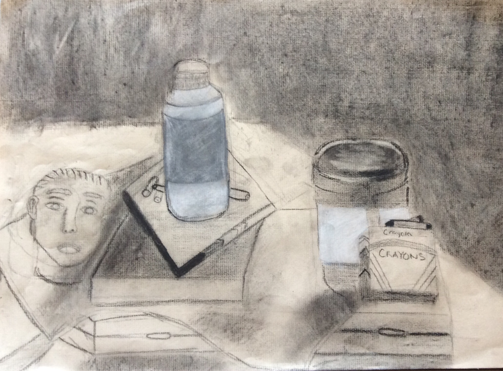
My group's theme was art materials. We had boxes of crayons, markers and charcoal. As well as cylinders of paint. We also had a sculpture of a head and face. I think the point of emphasis in my drawing is the white paint bottle because it really stands out with the white charcoal. To create contrast I used mostly dark charcoal but then to give it some contrast I used white charcoal which gave it a "pop". I think the bottom box (the base of our still life) was one of the best parts of my drawing as well as the smock on top of it. The part of my drawing that needs work is the shading, the box of markers and the head/face. I feel that the shading was not as accurate as it was in the actual still life because it was a little too dark. Also the shape of the marker box was not proportional.
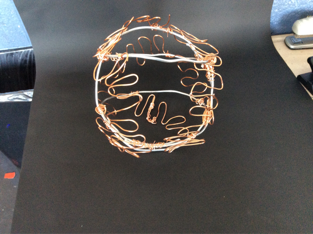
I chose to make a wire sculpture of a baseball. I made a line of thick silver wire in the shape of a sphere. I think the element that stands out the most on my sculpture is the brass stitching because it breaks up the silver color and it confirms that it is a baseball. To make the negative space look three-dimensional I made sure to make the sculpture proportional and circular. The brass wire makes a nice contrast with the silver wire because it is a little thinner and it gives the sculpture more color and brings it to life. If I had to change anything about my sculpture it would probably be the wires used to make the sphere. I think they are too thick and were hard to mold into the perfect circles I wanted them to. In conclusion I thought my project's form was decent, the shape was good but not perfectly symmetrical, and the space was well manage.
